Media Grid – WordPress Responsive Portfolio
Last Update: October 15, 2025
2
$3.95
Category: CodeCanyon
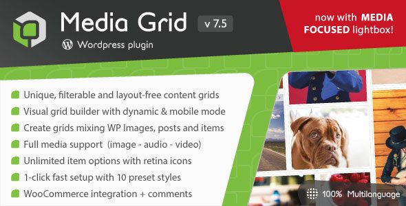
Media Grid is a plugin built to create responsive and filterable portfolios, galleries and grids. It is perfect for showcasing creative works like photography, design projects or any type of visual content in a visually appealing and organized way.
Key Features:
- Responsive Design: Automatically adapts to any screen size, ensuring your grid looks great on all devices, from desktops to mobile phones.
- Drag-and-Drop Builder: Easily create custom grids using the intuitive drag-and-drop grid builder, without any coding knowledge.
- Filterable Portfolio: Allows users to filter and sort items in the grid based on categories or tags, enhancing user navigation and experience.
- Multimedia Support: Supports various types of content, including images, videos, audio, and even custom HTML, making it versatile for different creative needs.
- Customizable Layouts: Offers multiple layout options such as masonry, grid, and slider, with extensive customization options for spacing, borders, and colors.
- Enhanced Visual Appeal: Create stunning portfolios and galleries that can be customized to match your brand’s look and feel.
- SEO Optimized: Built with SEO best practices in mind, helping your content get better visibility on search engines.
- Lightbox Integration: Includes a built-in lightbox feature for viewing images and videos in a pop-up, adding a professional touch to your portfolio.
- WooCommerce Integration: Integrates with WooCommerce, allowing you to showcase and sell products directly from your grid.

Media Grid – WordPress Responsive Portfolio
$3.95


